• Lettering + Illo
  • Hybrid Type
  • Shop
  • Resources
  • About
  • Contact
  • Sign In My Account
Menu

LYDIA KUEKES

Street Address
Durham, North Carolina
Phone Number

LYDIA KUEKES

  • Lettering + Illo
  • Hybrid Type
  • Shop
  • Resources
  • About
  • Contact
  • Sign In My Account
Day_16_01.jpg

Day 16

PRIMARY TOOLS & MATERIALS:
PAINT, SPECIALTY PAPER

Additional Tools & Materials: Adobe Photoshop, camera, scanner, light table, brush pen, inkjet printer, paint spatula

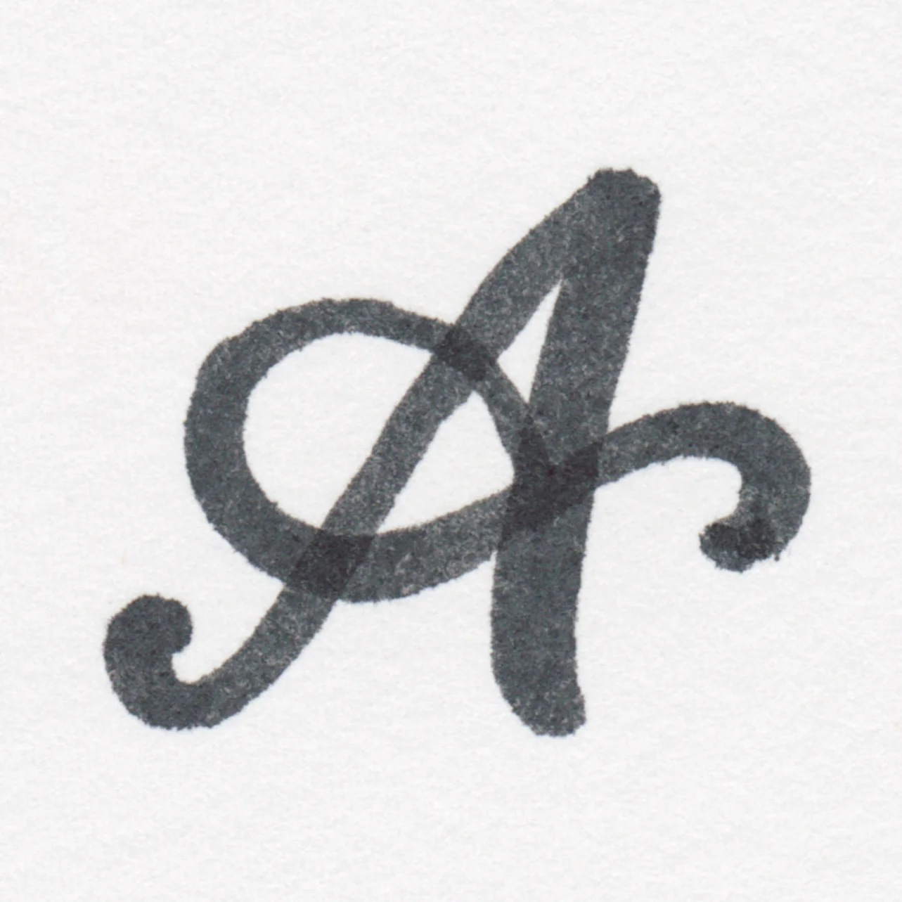
Today's mashup: paint plus specialty paper. Tattoo paper. I started in my sketchbook drawing many different styles of uppercase A with a thick Faber Castell brush pen before zeroing in on one I thought would make a nice tat. I scanned my work, picked the winning letter and created a sheet with 24 repeats of the letter in gray. Then I placed a clean sheet on top of my composite sheet and placed them both on my light table. Then I played with different treatments using acrylic paint - everything from layering to decoration to inlining and gradients. My favorite one was this red A with the suggestion of marquee lights as pink dots inline. 

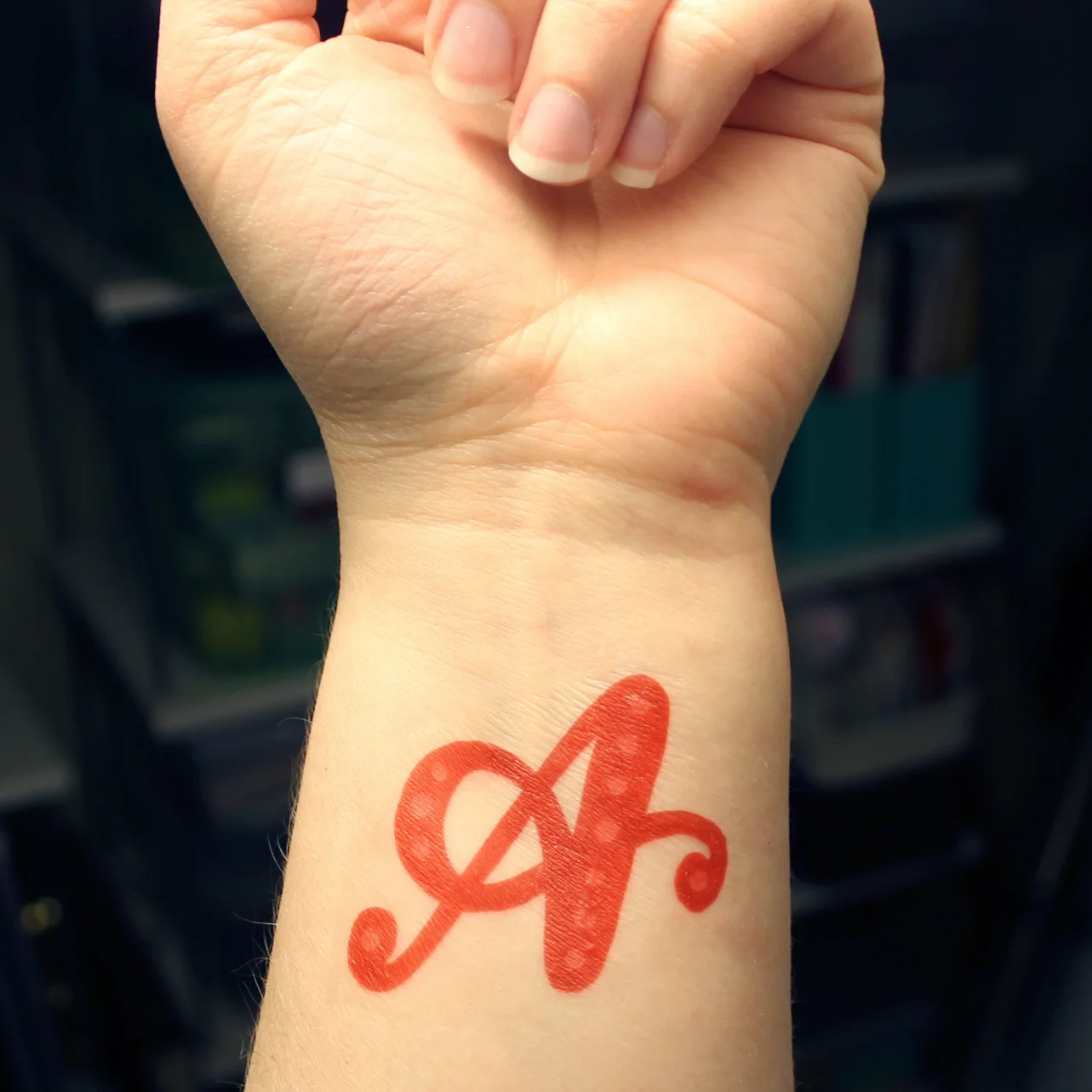
Again, I created a sheet of duplicates, but this time, printed them in reverse on temporary tattoo paper. I followed the package directions by printing onto the shiny cardstock, then applying a sticky adhesive sheet to the back and rubbing over each design with a smooth paint spatula. Then I cut one out, removed the adhesive, placed it on my arm under a moist cloth, and boom - temporary tattoo. 

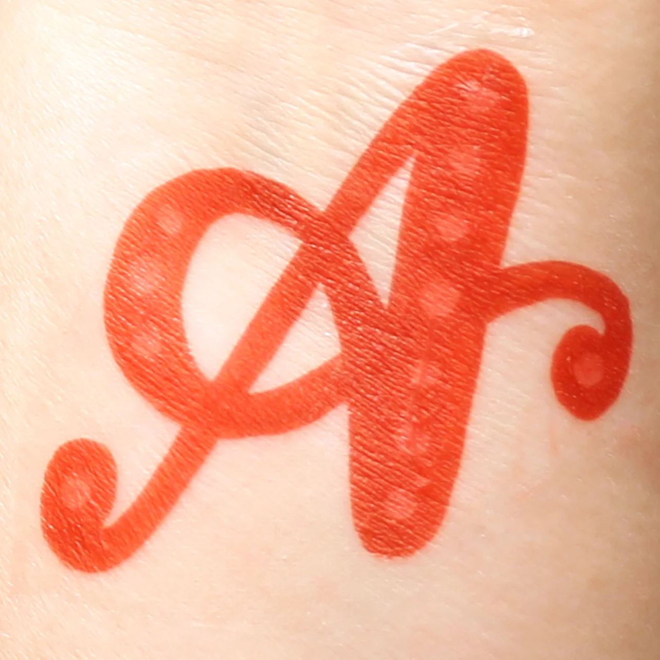
This study was fun because it bounced from hand to digital to hand to digital, and then literally to my hand. I enjoyed the variations that came from my studies in paint - I could play with the shape of the letter, the weight, the gesture, all while keeping the same basic letterform intact. Once the design reached my wrist, there's a huge degree of flexibility in the letterform. Twisting my wrist back and forth could easily turn this semi-italic script upright or extremely italic. There's also the inherent temporary tattoo wrinkling that can easily be seen in the first and last photo - it takes the wrinkles already there and multiplies them. I think a whole typeface based on temp tattoos would be fun if somehow it incorporated that side to side flexibility that comes with a design being placed onto the skin. 

Day 16

PRIMARY TOOLS & MATERIALS:
PAINT, SPECIALTY PAPER

Additional Tools & Materials: Adobe Photoshop, camera, scanner, light table, brush pen, inkjet printer, paint spatula

Today's mashup: paint plus specialty paper. Tattoo paper. I started in my sketchbook drawing many different styles of uppercase A with a thick Faber Castell brush pen before zeroing in on one I thought would make a nice tat. I scanned my work, picked the winning letter and created a sheet with 24 repeats of the letter in gray. Then I placed a clean sheet on top of my composite sheet and placed them both on my light table. Then I played with different treatments using acrylic paint - everything from layering to decoration to inlining and gradients. My favorite one was this red A with the suggestion of marquee lights as pink dots inline. 

Again, I created a sheet of duplicates, but this time, printed them in reverse on temporary tattoo paper. I followed the package directions by printing onto the shiny cardstock, then applying a sticky adhesive sheet to the back and rubbing over each design with a smooth paint spatula. Then I cut one out, removed the adhesive, placed it on my arm under a moist cloth, and boom - temporary tattoo. 

This study was fun because it bounced from hand to digital to hand to digital, and then literally to my hand. I enjoyed the variations that came from my studies in paint - I could play with the shape of the letter, the weight, the gesture, all while keeping the same basic letterform intact. Once the design reached my wrist, there's a huge degree of flexibility in the letterform. Twisting my wrist back and forth could easily turn this semi-italic script upright or extremely italic. There's also the inherent temporary tattoo wrinkling that can easily be seen in the first and last photo - it takes the wrinkles already there and multiplies them. I think a whole typeface based on temp tattoos would be fun if somehow it incorporated that side to side flexibility that comes with a design being placed onto the skin. 

Day_16_01.jpg
Day_16_02.jpg
Day_16_03.jpg
Day_16_04.jpg
Day_16_05.jpg
Day_16_06.jpg
Summary Block
This block is invalid. Please check the block settings and try again.
Featured
Aenean eu leo Quam
Aenean eu leo Quam

Quisque iaculis facilisis lacinia. Mauris euismod pellentesque tellus sit amet mollis.

Read more →

All images © Lydia Kuekes, 2016.