Day 20
PRIMARY TOOLS & MATERIALS:
BLOCK PRINTING, LASER CUTTER
Additional Tools & Materials: pencil, pen, tracing paper, scanner, Adobe Photoshop, laser cutter software, camera
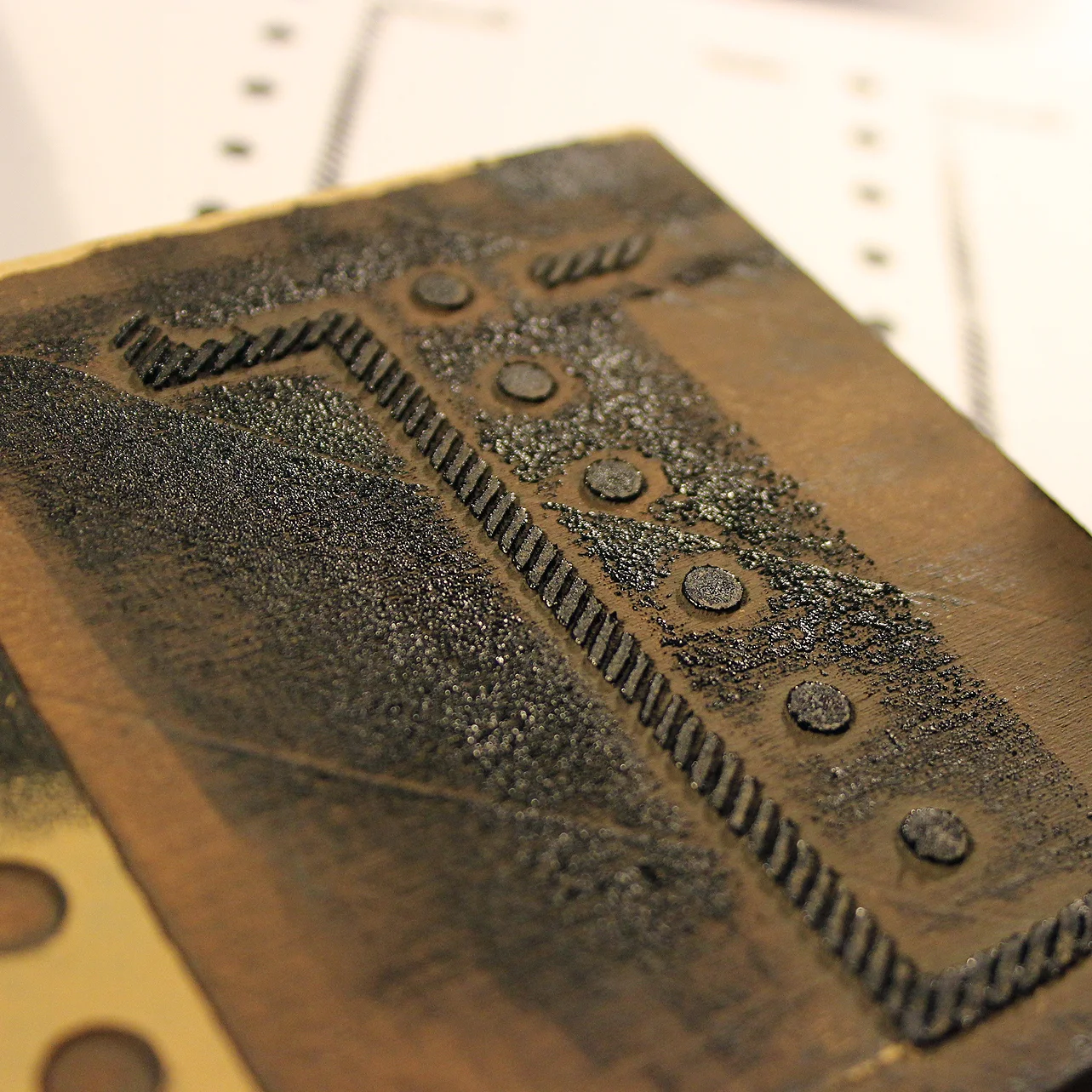
This letter required a lot of preparation, but less so than it would have without the laser cutter. Confession: this was both the first time I had worked with a linoleum block, and also the first time I'd worked with the laser printer. I wasn't sure what to expect.
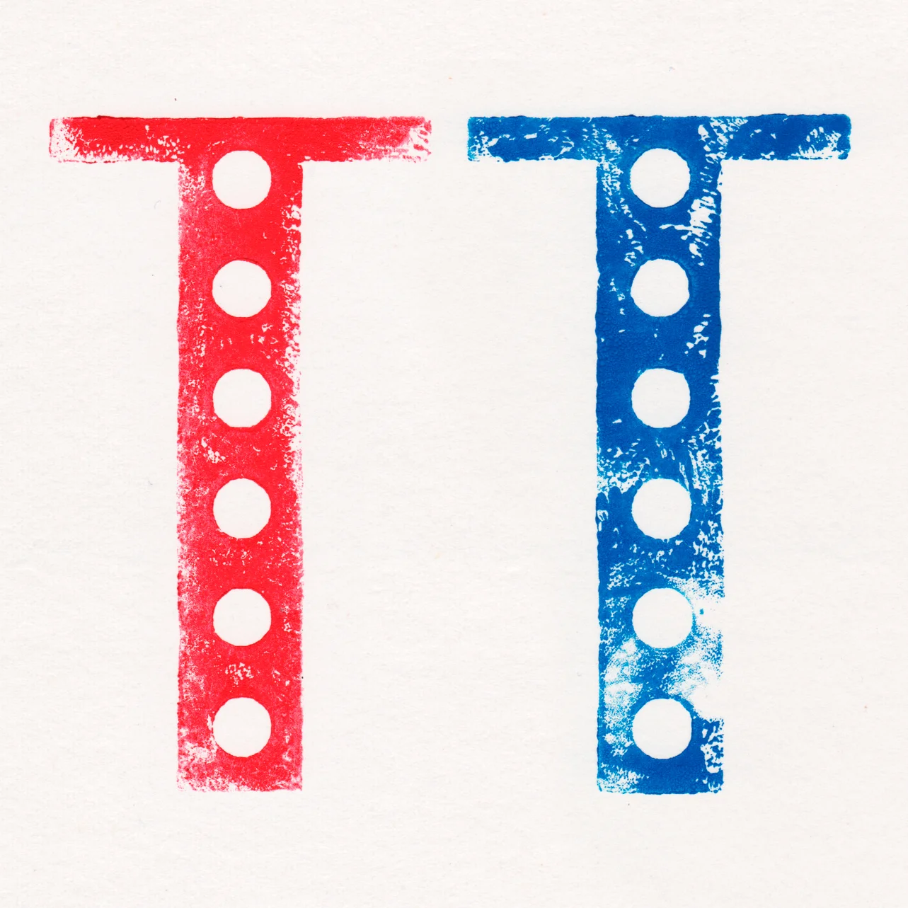
I started with a hand drawn letter T that was part of a screen printed design I created a few months ago. The t, as I had drawn it, did include the negative dots down the central stroke, but not the dots or the shadows, and since I always take on more than I'm actually prepared to take on, I thought "oh yeah, this definitely needs to be a two color print." So I added the dots and shadows in Adobe Illustrator and then prepared my file for laser cutting - which was incredibly simple, as it turns out. I simply separated the two parts of the letter that I planned to ink in different colors, and rotated them so I could fit them both on the same block.
I did bring two linoleum blocks with me to the Materials Lab at NC State just in case, but I didn't want to ruin one. I was very lucky to find the correct settings already listed on a chart, which ended up working perfectly the first time, though the laser did create a LOT of smelly smoke.
Once the dust settled and I'd rinsed off the the burn marks, I was ready to ink. Here's another confession: I tried to use plain old acrylic paint first. Don't do that. Block printing ink is more concentrated and spreads out more evenly, acrylic is just a gooey mess. Since both layers of the T were on the same block, I had to find some creative ways to ONLY ink the side I was trying to print. I tried covering the opposite side with tape, paper, even my hand, to try and keep the ink off the wrong layer, but it was still messy. My next problem is that since my design required me to cut away about 90% of the linoleum surface, my tall skinny design was hard to ink evenly without accidentally getting ink on the negative areas. This would have been easier with a smaller brayer (2"? 3"?) but I'm not even sure they make those. Then there was the question of whether to press the paper on top of the block (which is recommended) versus stamping from above. Again, the tall, skinny nature of this design made pressing the paper on top of the stamp near impossible without bending - or even puncturing - the paper. So I opted to place the stamp ink side down onto the paper, aligned with the top left corner of the paper so I could align the two colors.
After the first color (black) had dried, I inked the other half of the stamp, and attempted to line up the two colors. When I created the file for laser cutting, I had been very precise with my measurements, so that if I simply rotated the stamp 180 degrees and aligned the top left corner with the top left corner of the paper, the design would overlay perfectly. See image 7. This was not the case. I had to stack one of each of the designs on paper, line them up visually by holding them against the light, then aligning my stamp to the bottom piece of paper - which had the same design I was stamping onto the top piece. This sounds complicated but it was pretty easy to figure out once I got going.
The resulting letter is gritty - the inking is inconsistent and spotty in some places, and sometimes the stray ink that got on the negative bed of the block found its way onto the paper. I learned that this process is by nature imprecise, and requires a lot of patience and planning ahead. Cutting my design onto the block with the laser cutter allowed me to create a much more complex and detailed design than I could have done by hand - especially on my first try. Stay tuned, though - carving by hand is still on my list of type explorations to try.


