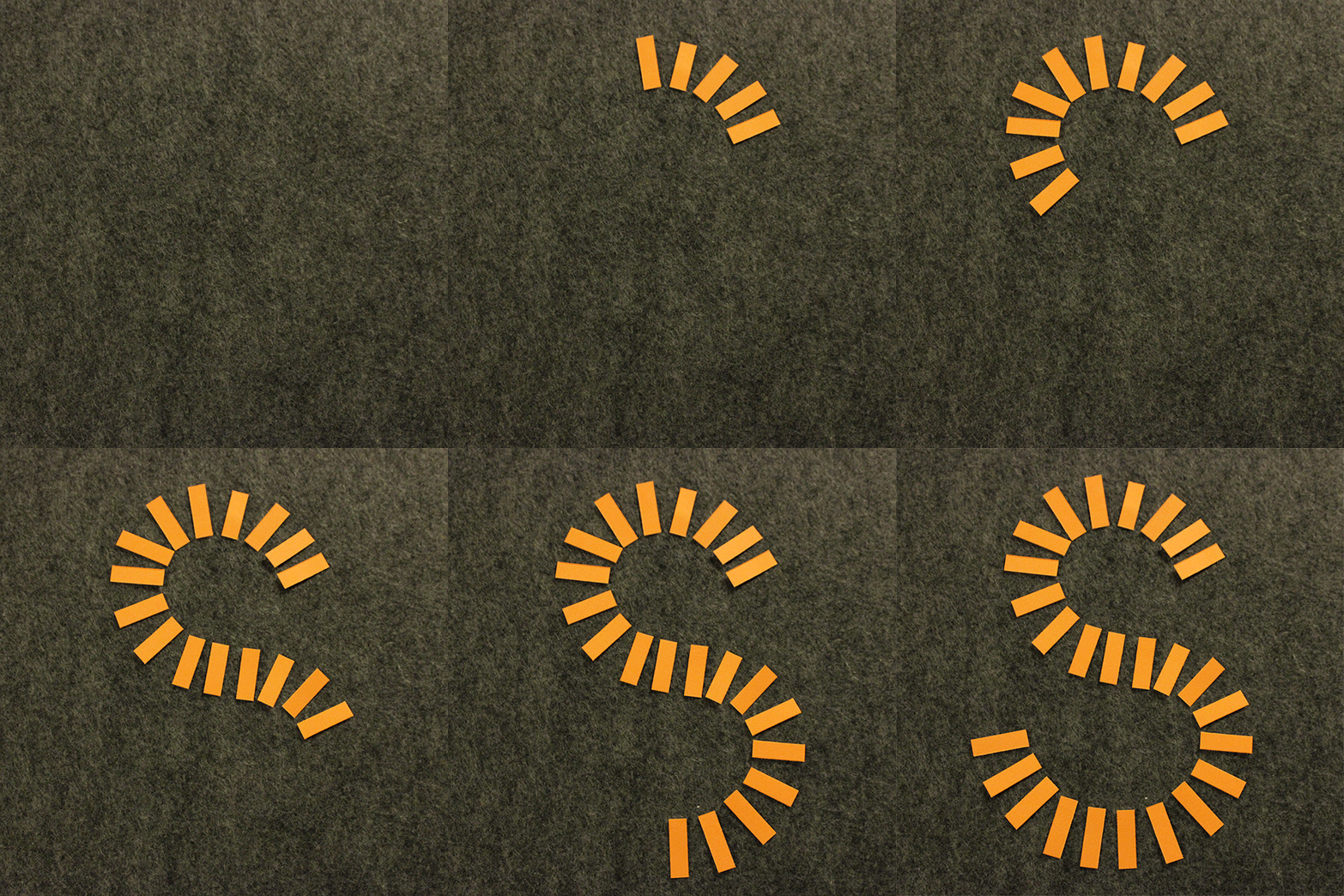


Additional Tools & Materials: scissors, felt, tripod, Adobe Photoshop
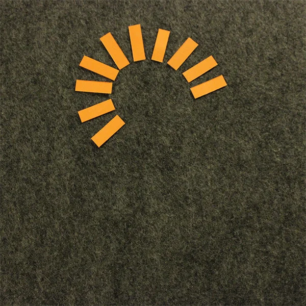
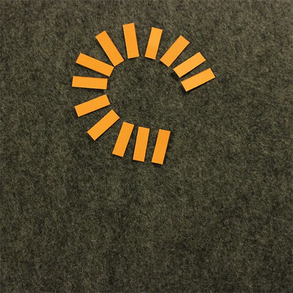
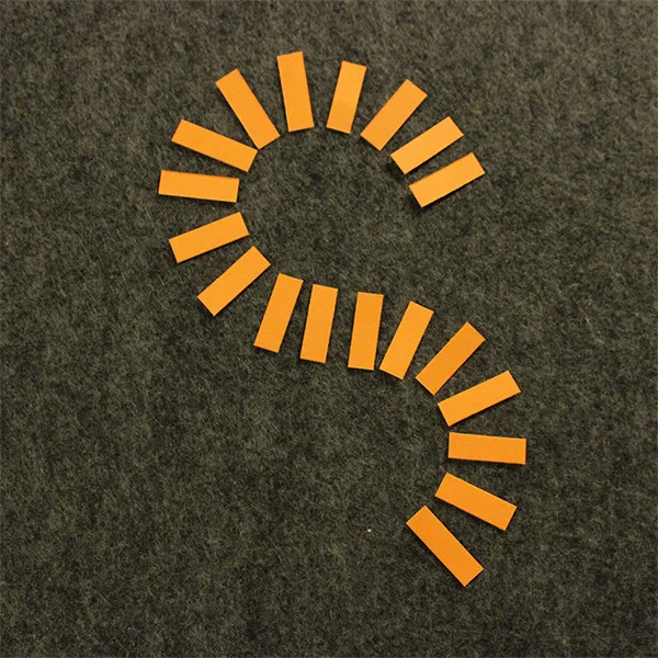
Today the matchup is paper and photography. I wanted to try making a stop motion animation, which I had haver done before, and which I now LOVE. This was so much fun. My letter was S, which already has a lot of movement in it, so I wanted to keep it simple. To show it being "built," I decided to use small rectangular strips of paper and animate them as they snaked around to form the letter's shape.
Confession: I created this backwards. Way easier than having to guess what shape you're making while trying to photograph it. So I placed all my paper onto some felt (to hold it in place), until I was happy with the letter's form. Then I set up my lighting, camera and tripod to aim directly down at the "stage." I set my camera focus and settings to manual so that nothing would change throughout the photo series, then I began the process of taking one photo, removing one strip of paper, taking the next photo, and so forth. Then it was as simple as loading the sequence of images into Photoshop, cropping it, and exporting an animated .gif. Honestly the most difficult part was converting files to be able to also show this in motion on Instagram.
This process requires a lot of planning ahead, especially if you're working with something a bit more complex than this simple letterform. I could see this kind of dynamic type being a great application in a digital atmosphere, but translating it for print might be a challenge. It would be interesting to gauge how many "strips" of this letter you actually need to recognize it as an S - or any letter, for that matter. Perhaps in a live typeface the user could slide the "legibility" scale up and down to use more or less "paper" strips in construction.