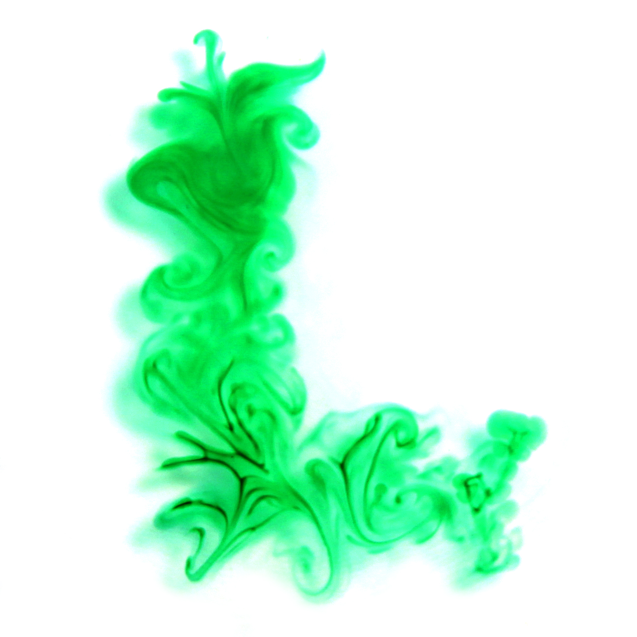
Day 51
PRIMARY TOOLS & MATERIALS:
WATER, ADOBE PHOTOSHOP
Additional Tools & Materials: food coloring, various glass containers, paintbrush, q-tips, camera
Today's combination of "elements" and "computer applications" was quite a challenge - I wanted to write with water. Well, in water. You may remember I did that a few weeks ago but this time I wanted to do it differently; rather than placing water on top of a surface, I wanted to use water as the surface and write in it, using liquid food coloring. I've always loved the way ink or dye billows as it falls through water - it looks smoky and mysterious. I thought it would make some dreamy letters.
I started with a small, square vase full of water - and carefully added one drop of food coloring at a time to the surface of the water and took tons of photos as the ink drifted downwards. This produced some beautiful shapes, but nothing that resembled a letter. Then I thought that maybe if I made a "bar" of ink and let it settle, then a "column" of ink to the left, it might drift down in the shape of an L. Nope. Again - beautiful patterns but nothing I could use to make an L.
Then I switched to a tall cylindrical vase. I thought if the ink had more distance to travel I might be able to isolate some shapes and turn them into Ls. I had - after all - given myself full permission to heavily manipulate these images in Photoshop. Still nothing I could use!
So finally I switched to a small glass salad plate filled with about a quarter inch of water. This way, the food coloring didn't have far to sink, and I thought I'd be able to shape it more slowly, and maybe even layer the dye on top dye that had already sunk to the bottom. Bingo. Using a small paint brush I carefully dotted ink onto the water, then used the fine point of the brush to create spirals, fractals, and gradients. Try though I might, I wasn't able to do an ornate script-style L. The closest I got is in image 5 - but I couldn't build on it in a way that made the letter any more legible. Crossing the "strokes" in the ink caused them to disrupt and disperse each other - which generally led to a mess.
This was the least amount of control I've had over any of the materials I've experimented with so far. Luckily, cleanup and reset was fairly easy, so it didn't matter that I had to rinse and refill my vessels a dozen times as I tried to make one legible L. Once I'd switched to the shallow glass plate, I found that the most variable results came from how much water was in the dish. A quarter of an inch was easy to work with. Much less than that and the ink didn't want to stay in one place - instead it quickly spread out in large circles, and couldn't be manipulated any more. I can only guess that the lower amount of water meant that the ink immediately sunk to the bottom and then couldn't be shaped by simply disturbing the surface. So if you want to try this yourself - try a quarter inch of water and a tiny paintbrush - the results are pretty fun.
This study can be best described as unpredictable. The letters I created all have a swirly, asymmetrical, mysterious quality. They are impossible to recreate. I would imagine a full typeface in this style would be difficult to create in a uniform weight. Perhaps that could be part of its design - tons and tons and tons of alternate shapes, so you might not see a repeat in a sentence written in this font. Or even better - the letters could be made of modular, mix-and-match, random components so that each letter would be completely unique.


