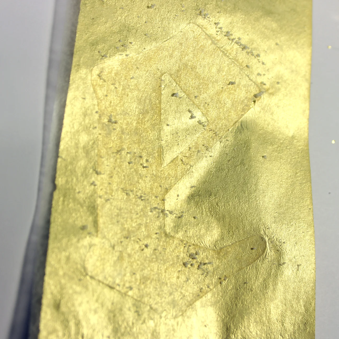
Day 66
PRIMARY TOOLS & MATERIALS:
PAPER, GOLD LEAF
Additional Tools & Materials: die cutting machine, die cutting software, xacto blade, craft spatula, scrap paper, adhesive pen, camera
This letter is the result of pairing paper with advanced paper & materials. I decided that today that would be gold leaf. I found a starter kit at the craft store that included an adhesive pen and six sheets of gold foil, as well as some very inadequate instructions for use. I wasn't sure what to expect from the gold leaf, so I decided to use it in several different ways.
I chose several existing typefaces to experiment with, but only applied gold leaf to three. The first, image one, is Wild West Wind. The second, shown first in image 2, is called Manuskript Gotisch. the third, seen in image 3, 7, and 10, is called Sign Painter. I chose these because they had quite different characteristics, and I wondered how the foil would adhere to different type shapes.
After cutting out 3" letters from card stock with my die cutting machine, I read the (again, incomplete) instructions on my gold leaf kit which told me to draw on the paper with the supplied adhesive pen, which wrote a lot like a watery paint pen. The packaging said I was supposed to let this dry for five to ten minutes before applying the foil, and that the ink would turn light blue when it dried. The ink did not change color after ten minutes, so I went with it. I tried several different methods of applying the foil, since I didn't know what kind of coverage I would get. First, I tried coating the entire letter in foil (see images 4, 5, 6, and 9). This went pretty well once I figured out how to actually apply the foil. Then I wanted to see if it would stick to a pattern - so I drew stripes onto the second letter (image 7, 10). This didn't work at all. It only adhered to the top half of the letter, and didn't recognize the stripes at all. I had thought it might behave similarly to toner reactive foil, and only stick to the glued areas. Not the case. In the last letter (image 1, 8, 11) I used the adhesive pen to follow the outline of the letter then pressed foil to the outline, one small piece at a time. This ended up being my favorite because it communicates most clearly how the foil was applied, and the flimsy, flyaway nature of the foil itself.
Working with gold foil is messy (albeit a beautiful, sparkly mess) and unpredictable. The foil wouldn't always stick where it was supposed to, and despite being very delicate, it didn't always cut cleanly with the xacto blade, tending instead to catch and tear as the blade passed over. The foil would also stick to places I didn't want it to stick, which required poking and scratching with the xacto blade to remove small bits of gold. The outcome, however, is visually striking. The gold reflects differently at any angle, and holding the letters, you can't help but rotate them to see the range of light the letter generates. The texture, when fully covering the letter as in image 9, looks as though it was painted on rather than pressed as a solid sheet. A letter covered in gold feels precious, valuable, and rare. This treatment would be appropriate in small doses, again - for the same reasons - how can you expect to stumble upon an entire sentence or paragraph covered in gold? One gilt letter or word should serve as enough to stress the rarity and value of the message it carries.


