Day 25
PRIMARY TOOLS & MATERIALS:
NEEDLE & THREAD, TEXTILE MACHINERY
Additional Tools & Materials: Adobe Photoshop, Bernina DesignerPlus embroidery software (on a PC!), scissors, fabric, patience
This was one of the more obvious matchups: needle arts and textile machinery. I'm calling it a hybrid because it required a lot of technical sewing know-how, hands-on problem solving, and common sense on the part of the machine operator to get this design off the ground. First a HUGE, HUGE thanks to Kelly Kye - maker of amazing hand-sewn quilts atKye + Hardy, recent NC State Design Master's grad, and most experienced user of the ancient but extraordinary Bernina Deco 650 embroidery machine in the Fibers Lab at NCSU College of Design - for guiding me through the process of preparing artwork for the machine and getting it to do my bidding. Thanks so much for giving me a morning of your time, Kelly - and a big thanks also to Professor Susan Brandeis for letting me play with your toys.
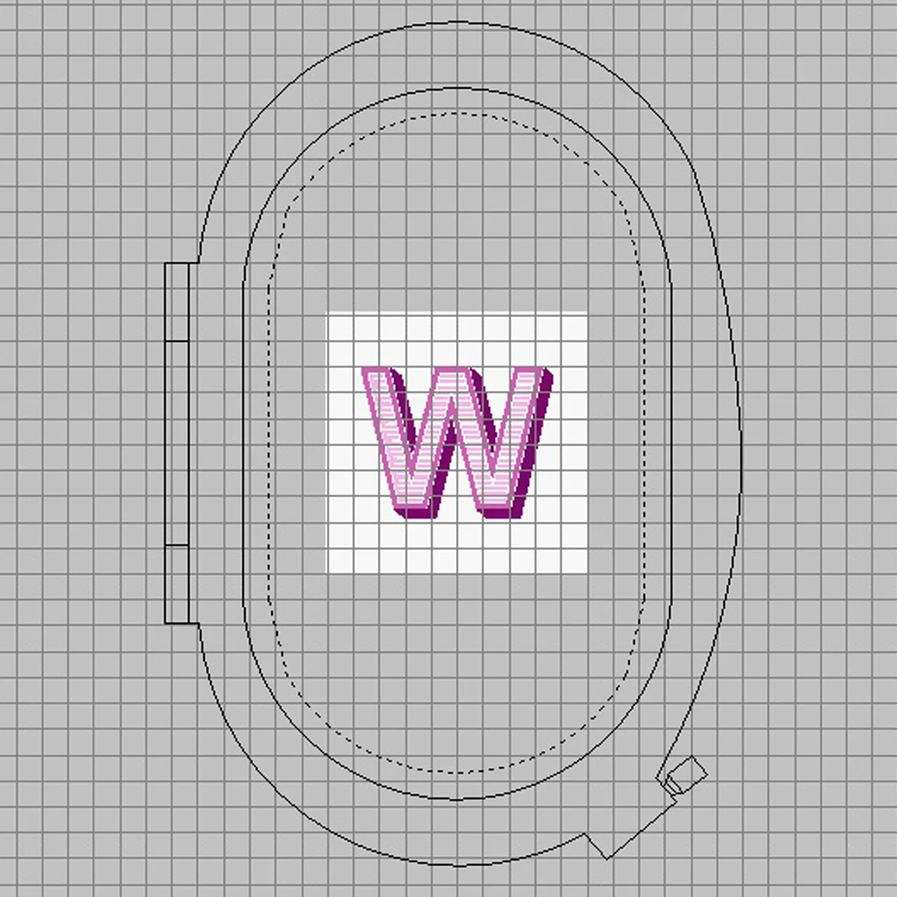
Before I decided what I wanted to do with the embroidery machine, I visited the Fibers Lab and reviewed the handy user guide Professor Brandeis created and left at the station. I took note of the machine's capabilities (number of colors, size, and so forth), familiarized myself with the actual machine and its components, and poked around in the Bernina DesignerPlus software. Knowing what the machine could do helped me choose what I wanted to make. I decided that the best way to emphasize the construction of this letter would be to choose a fairly complex letterform, and render it in at least three colors.
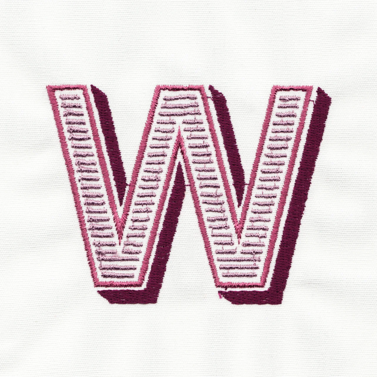
I chose the letter W, using three of the five fonts in AW Conqueror Carved- a type family that can be layered and deconstructed to use only the parts you wish to display. It's possible to layer only the outline and the shadow, or the outline and the lined fill, and so forth, making it versatile and adaptable. I also wanted to use a strong geometric letterform so that any unevenness in the embroidery would be more evident.
Though it took a bit of troubleshooting (mostly in the design software), Kelly and I were excited to see how cleanly the the letter was rendered onto the canvas cloth. After three test runs, I was delighted to encounter no machine or user errors in our final execution. Fun fact: it is much easier to operate the laser cutter right down the hall than it is to operate this twenty year old embroidery machine. Who knew.
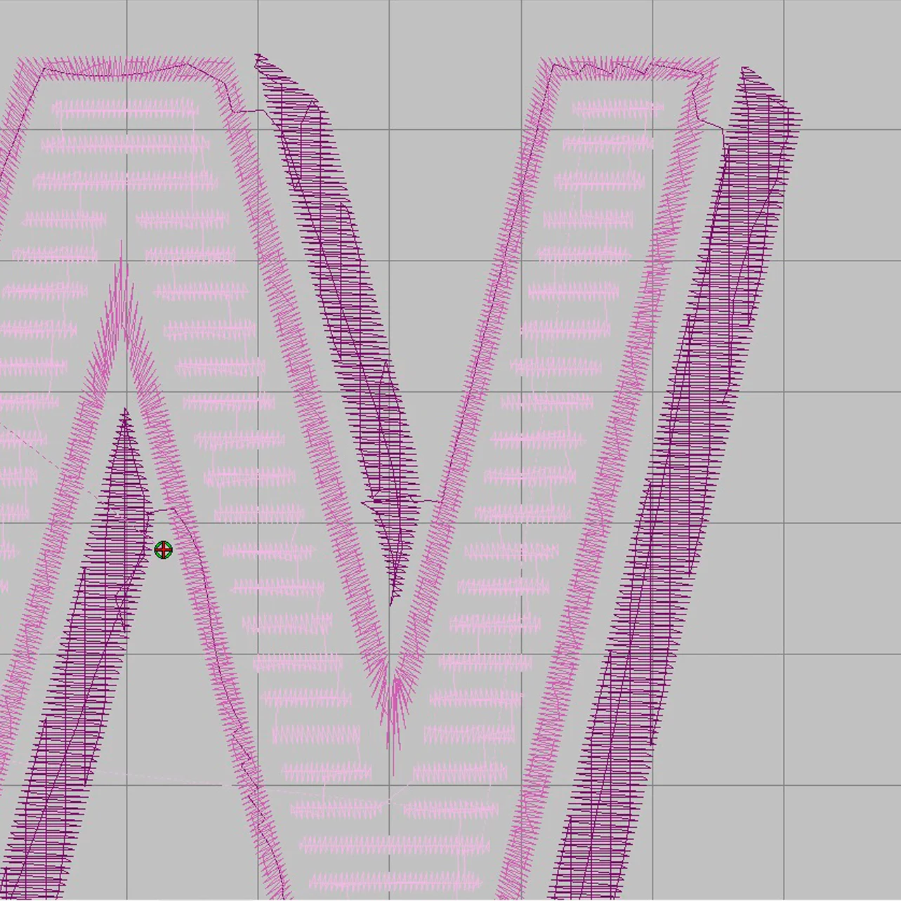
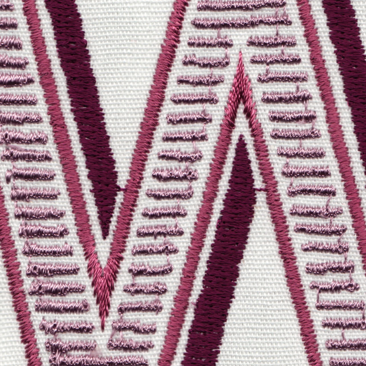
The results of this study gave me a letter that very much resembles the original typeface, but with more dimension. The satin thread I used, contrasted with the matte canvas cloth gives the letterform shine, which makes the direction of each stitch more visible. Each part of the letter has been sewn in a different direction. The inner horizontal stripes are made of tiny, close-spaced vertical stitches. The central outline's stitch changes direction as it wraps around the letter, with dramatic pointed angles in each of the three inner crevices of the W. The dark shadow is filled in a horizontal satin stitch. One feature I can't really fix (at least outside of Photoshop) are the steps that connect the different "blocks" of this letter's design. In some spots, notably the inner stripes, you can see one thin thread that connects one section of embroidery to the next. While the machine is working, you can sometimes pause, sneak in, and snip these - especially when they're really long - before they become "trapped" under layers of sewn thread. The smaller ones are harder to snip without tiny scissors and tweezers. I decided not to maul this freshly finished design with sharp objects, and instead left the steps as further evidence of this letter's construction.


