



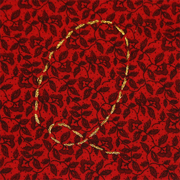

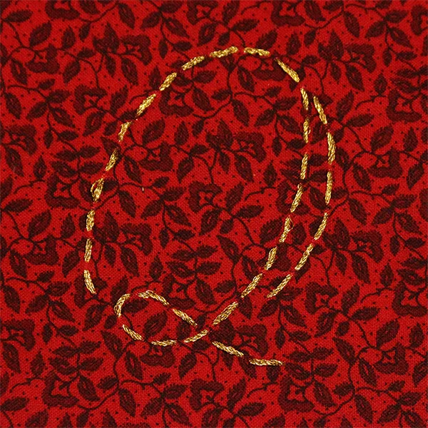
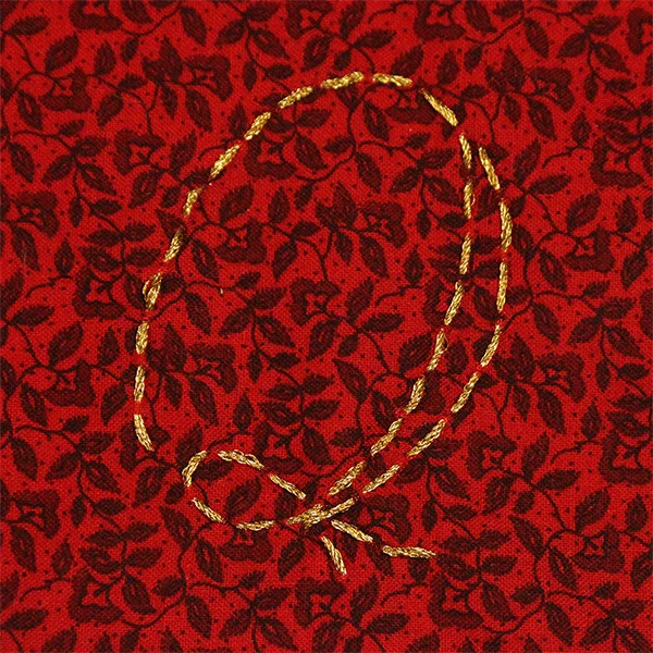

Additional Tools & Materials: fabric, clipboard, tripod, painter's tape, inkjet printer, xacto knife, ball point pen, inkjet printer
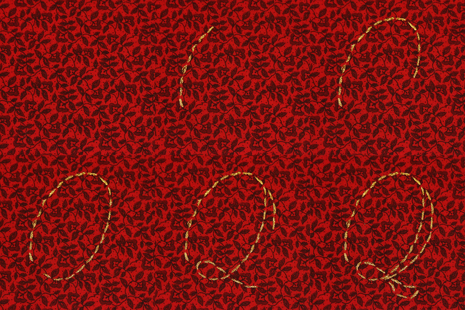
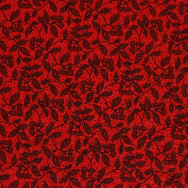
Another stop motion today, but a little more complex than the last one onDay 47. Today I matched up sewing and photography. Since my last stop-motion was fairly simple, I wanted to make this one a bit more ambitious. At first, I even tried to create this cursive Q in a more complex stitch, but it was too complicated to manage while maneuvering around my tripod and only lifting the bottom of the fabric to sew. I even picked the ornate floral fabric here to amplify the slight movement of the material as it's sewn.
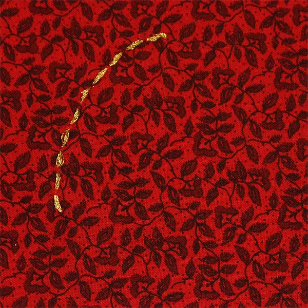
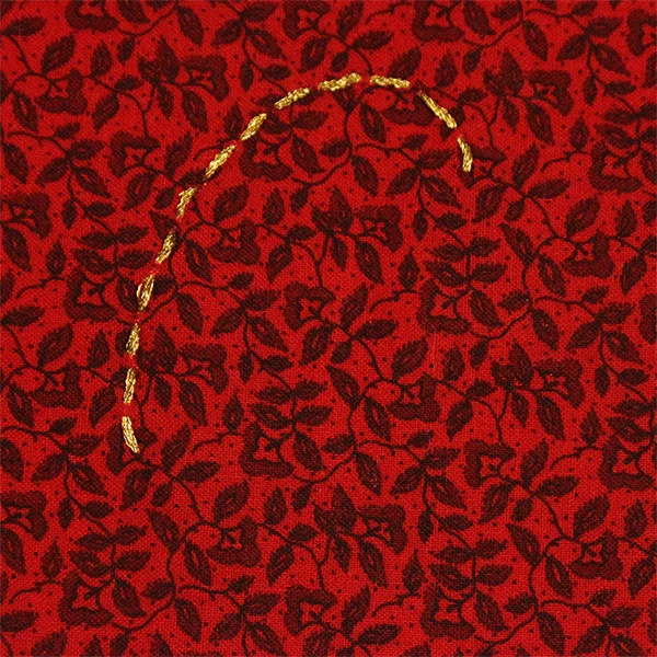
I used a similar process this time as on Day 47, but instead of making the whole letterform then removing one piece as I took photos, this time I had to create the letter as I photographed it. I knew I'd need some kind of template, so I printed a cursive Q and traced it in ball point pen onto the back of my fabric. Then I used painter's tape to attach the top edge of my fabric swatch to a sheet of card stock, then firmly clamp the paper and the fabric into a clipboard. For good measure, I used painter's tape to secure the clipboard to my desk. Then I set up my camera on a tripod, aimed at the fabric. After all the setup, I just had to sew the letter one stitch at a time, leaving the fabric attached to the clipboard and only lifting the bottom edge to see the template on the back. So I wouldn't have to stand up and risk nudging the camera every time I needed to take a photo, I used my camera's remote control to snap a shot after each stitch. Once I'd finished the first stroke, I decided to widen the down strokes for a bit more dimensional letter.
This letter can best be described as quirky, and the colors give it a royal, almost holiday feel. As my freehand stitching progressed, the gaps between stitches decreased while the length of the stitches increased. No one can argue that this unruly letter wasn't made by hand. The characteristic that stands out most is the direction of the stitching, and how it demonstrates the motion a pen would take in writing this letter. The double stitches then mark where the wider strokes would be. The letter works best as an instructional instrument for hand lettering - it would be revealing to demonstrate all upper and lowercase script characters in this way, to indicate the proper way these letters should be drawn.